The below is from a recent edition of the Deep Dive, Bitcoin Magazine’s premium markets newsletter. To be among the first to receive these insights and other on-chain bitcoin market analysis straight to your inbox, subscribe now.
In today’s Daily Dive, we’re covering some visuals to illustrate bitcoin’s spot and derivatives market dynamics. We can do this by looking at two key metrics compared to price: the futures perpetual funding rate and the long-term holder net position change.
As a refresher, the futures perpetual funding rate was covered more in-depth in The Daily Dive #097 – Derivatives Market Breakdown. It’s a key rate to watch, especially when the market is overleveraged to one side with the derivatives market having more influence over the short-term price.
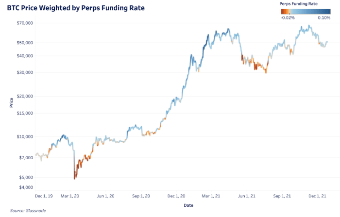
The two charts below show bitcoin price overlaid with the perpetual funding rate. Since the market is historically biased long, the color thresholds are lowered in the second chart to better emphasize periods of any negative funding. Overall, the charts show when the derivatives market is either inflating or suppressing price.
The dark blue areas show when the market was overleveraged to the long side and the dark red areas show the opposite. Each of these extreme periods come with subsequent, explosive moves in price as positions are wiped out.

The dark blue areas show when the market was overleveraged to the long side and the dark red areas show the opposite.
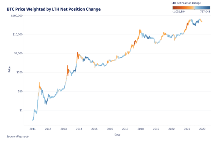
The derivatives market influences price in the short term but long-term price is driven by adoption, sustained spot demand and the behavior of long-term holders. The long-term holder net position change is one way to view this behavior as it’s the 30-day change in supply held by long-term holders.
As we’ve covered before, every bitcoin price all-time high comes with a significant distribution of coins from long-term holders to new market entrants. Periods of dark red show this in the below chart while periods of dark blue show relatively heavy accumulation periods over bitcoin’s lifetime.

Credit: Source link


 Bitcoin
  Ethereum
  Tether
  Solana
  XRP
XRP  Dogecoin
  USDC
USDC  Cardano
  Lido Staked Ether
  Avalanche
  TRON
TRON  Toncoin
  Wrapped stETH
  Shiba Inu
  Stellar
  Wrapped Bitcoin
  Polkadot
  Chainlink
  Bitcoin Cash
  WETH
WETH  Sui
Sui  Pepe
Pepe  NEAR Protocol
  LEO Token
  Uniswap
  Litecoin
  Wrapped eETH
  Aptos
Aptos  Internet Computer
  Hedera
  USDS
USDS  Cronos
  Ethereum Classic
  POL (ex-MATIC)
  Render
  Bittensor
  Ethena USDe
  Artificial Superintelligence Alliance
  Arbitrum
  Celestia
  Dai
Dai  Filecoin
  WhiteBIT Coin
  Stacks
  Bonk
Bonk  OKB
OKB  Cosmos Hub